
Learning How to Un-See
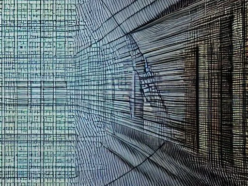
Illustration of the concept of gestalt created by the author using the Stable Diffusion text-to-image generation tool
In the previous issue of metaphor* I wrote about the growing importance of visual thinking skills. While most of us are primarily verbal thinkers, your thinking style is not set in stone. You can improve your visual thinking skills, including:
Your understanding of the ways you take in, process, and respond to images.
Your ability to communicate more effectively using images.
How you work with those who predominantly think in pictures.
Your awareness of the many ways you can integrate visual thinking into your creative workflow.
Learning how to think with images begins with learning how to see, or perhaps more accurately, learning how to un-see. Your open eyes are always looking, collecting images and sending them to your brain. And your brain is always processing the images it receives—comparing new images to what you already know and creating connections between different sets of related images and ideas. But most of us rarely stop to think about how we gather, sort, categorize, and group the visual elements that make up the images we’re constantly assembling in our brain.
Your brain is wired to minimize the time it takes you to decode an image and react to it. To accomplish this, your brain simplifies and interprets the visual information your eyes transmit as you look at the endlessly changing world in front of you. Advertising capitalizes on this primal instinct. But learning how to think with visual information (not just react to it) requires a different way of seeing, one that enables you to pause the instinctual labeling and stereotyping of the visual images you’re processing and see the individual elements in the image. Once you become conscious of these details, you can retrace your attentional path—the steps your brain automatically took as it simplified the information in the image—and choose to see from a new perspective.
How Your Brain Processes Images
Thousands of green, yellow, and red leaves blend to become an early autumn tree. A flock of birds flying in a close formation becomes a single object flowing overhead. An infinite variety of differently shaped skulls, eyes, noses, mouths, ears, and hair styles effortlessly coalesce into a human face. How does the brain assemble whole objects from so many parts?
Our brains are designed to see patterns and structure in complex images: to organize and simplify images so we can understand the environment around us with less mental energy. This highly developed ability to identify and recognize patterns (to “inform” them) enables us to identify forms even when we’re only given partial or fragmented information.
In the early 1920s, a small group of Austro-Hungarian and German psychologists began publishing articles on the primary ways the human brain subconsciously simplifies and organizes the disparate parts in a complex image into a unified whole. Their work evolved into what we now refer to as the Gestalt Principles.**
These are the seven primary principles of gestalt theory:
Symmetry & Order (also called the “Law of Simplicity) - Your brain always looks for the simplest way to understand a thing. It will perceive ambiguous shapes in as simple a manner as possible. For example, your brain could read the Olympic logo below as a meaningless series of curved, broken lines. Instead, it reads it as a series of interlocking rings:

The brain’s powerful preference for simplicity drives the other principles that follow.
Similarity - Your brain automatically groups similarly colored, sized, and/or shaped visual elements, even if they’re not next to each other. The image below reads as alternating rows of color instead of a single block of dots because your brain is grouping the rows of similarly colored dots together:

Continuation - Your eye follows the smoothest path when following a line, even if the smoothest path has gaps. The World Wildlife Fund logo takes advantage of your brain’s preference for continuous, smooth flowing lines:

Closure - Your brain automatically fills in the missing parts in an image to create a complete shape or what gestalt theory calls a “pleasing whole.” For example, in the IBM logo below, your eye transforms the three stacks of horizontal blue lines into the letters IBM:
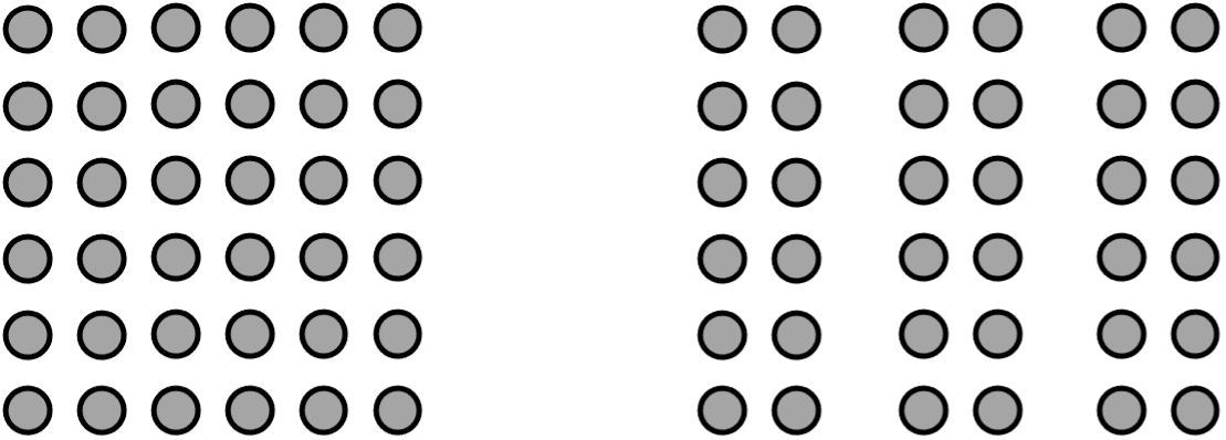
Proximity - Your brain transforms closely spaced elements into a single group. Conversely, it separates widely spaced elements into distinct groups. In the image on the left below, we see the dots as a one block because the dots are closely spaced. In the block on the right, the same number of dots read as three separate columns because of the space between the second and third, and fourth and fifth columns of dots:
The Figure/Ground Principle - Your brain sees objects in the foreground of an image (a figure or focal point) first and the background (ground) second. In most cases, it reads the smaller areas in an image as focal points and the larger areas as background. In the familiar Rubin’s vase graphic below takes advantage of this principle to present you with two possible interpretations. What do you see in the when you look at it?

Image Source: Wikipedia Commons
Synchrony (also known as Common Fate) - Your brain transforms elements that point to or are moving in the same direction into a single group. It also transforms things that are changing together into a single group. For example, lights that flash together are perceived as a single group—a principle that flashing signage everywhere takes advantage of. When birds fly in the same direction, we perceive them as a single group (flock). Marching bands also take advantage of this principle as they move together to create symbols, words, and visual effects.
The Gestalt Principles help us understand that we don’t just see with our eyes. What we see is shaped by the instinctual processes our mind uses to manage the visually rich and complex visual environment around us. Designers and artists use these principles to direct (and sometimes exploit) our attention. You can also use them to deconstruct your instinctual visual responses and reorient your perspective.
For example, if you’re looking at a still life of a basket of red apples on a table in a richly decorated room and you recognize that you’re focusing on the basket of apples as a single visual element, you can consciously unbundle the grouping your mind instinctually creates:
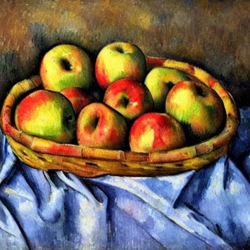
A wicker basket filled with apples created by the author using the Stable Diffusion text-to-image generation tool
Begin by refocusing your attention on the individual apples in the basket. Look at the various shapes that make up the whole, and the different shades of red the artist uses to create the skin of each apple.
Now look even more closely at an individual apple: notice the brushwork the artist used to create the surface of the apple. Is it finely worked to create a realistic apple, or are the individual brush strokes more visible, perhaps almost distinct shapes of their own?
Step back again and slowly shift your focus from the basket of apples to an individual apple… Do you sense a difference in your level of engagement with painting? Can you notice when your brain is simplifying and categorizing the elements in the picture vs. when you’re focused on a single apple and the brushstrokes the artist used to create the illusion of the surface of the apple?
When we interrupt the instinctual simplifying, organizing, and categorizing processes of our brain, we create a mental space for added layers of complexity and meaning. Our thoughts become more nuanced and textured. Our senses are awakened and engaged. Instead of just looking, we begin to see.
The Power of Changing Your Focal Point
Your brain is exceptionally good at filling in missing visual information in images to create a familiar whole out of a smattering of parts. This is why even simple symbols (such as the smiley) can conjure a face and communicate a very specific emotional state (happiness). The empty space around and between the primary subject(s) in an image is called “negative” or “white” space. The FedEx logo below famously takes advantage of your ability to read white space in an image as either foreground or background (the Figure/Ground Ambiguity gestalt principle):

Do you see the arrow shape formed by the white space between the lower half of the orange capital E and the lowercase X? If not, take a moment to consciously focus on the white space between the two letters. Your brain will quickly recognize that the negative space between the two letters forms an arrow.

The logo’s designer (Lindon Leader) carefully uses a range of typographical elements (such as the font type, type weight, and letter spacing) as well as color to form the arrow and convey two key aspects of FedEx's brand identity: speed and precision.
When you consciously switch your attention from the subject(s) in the foreground to the seemingly empty or negative space you instinctually read as background, you often unlock new, revealing perspectives. In her book Inhabiting the Negative Space, the artist, writer, and educator Jenny Odellshares how she switched her attention to the negative space around subjects she was trying to draw to diminish the power of her preconceptions about the shape and form of the human body:
When I was in high school, I would attend live figure drawing classes at the local community art center. I often had difficulty with parts of the body I had a lot of presumptions about, like faces and hands. But eventually I stumbled upon a trick: I would draw instead the outline of the negative space around it. Though I couldn't have articulated it at the time, what this method did was improve the quality of my looking. I would never be able to get away from my preconceptions about what an arm or a leg looks like, but the shape formed by its negative space would always be unfamiliar to me, and therefore I would be forced to look more closely. I think I know what an arm looks like, but I don’t know what this arm looks like, from this angle under this light at this exact moment.
— Jenny Odell, Inhabiting the Negative Space
Changing your instinctual focus on foreground subjects can reveal possibilities that might be otherwise obscured. It can also reveal vital information that’s only apparent when you switch your perspective because it exists on a different plane—a different visual plane and/or temporal plane. For example, imagine you’re looking at a series of five photographs of a slowly decaying barn, taken from the same perspective every ten years over the course of fifty years. Our natural tendency would be to focus on the slow collapse of the barn itself—the slowly caving roof, the weathering wood, the weeds growing in the shadowy light just inside the open barn door…

A weathered barn in a fallow field with hills and trees in the background, created by the author using the Stable Diffusion text-to-image generation tool
The scene might call to mind a time gone by, the passage of time, and our eventual decay. But what if you shifted your focus from the barn to the background—the field, the hills beyond. What might you see? What might you learn?
Perhaps you’d notice how the native vegetation took over the fallow field in the first ten years, and the new species of trees at the edge of the field that took root in the next ten years. You might see new nests in the trees as different species of birds returned to the area thirty years on. The most recent photograph might reveal completely new species of wildflowers, trees, and wildlife flourishing—perhaps a sign of climate change. The point is there’s valuable information in the background that’s only unlocked when you change your perspective.
The best way to improve your ability to think with images is to actively think about images—how they work and how you respond to what you see, in the world around you and in the visual images created by others. Ask yourself how you can use the gestalt principles the next time you’re trying to create a graphic to communicate an idea. For example, how might you simplify the images in your next presentation to make it easier for your audience to grasp your key message? How might you use color to group similar types of information together into a more meaningful whole? You don’t need to be a professional designer or artist to improve your presentation of visual information. You simply need to practice the art of shifting from just looking to truly seeing.
Footnotes
* The Emerging Presence of Digital Thought. (October 20, 2022)
** The German word “gestalt,” which means shape, figure, or form, is often used to refer to the sense we derive from a whole or complete experience.